Water Polo Canada Logo Designs
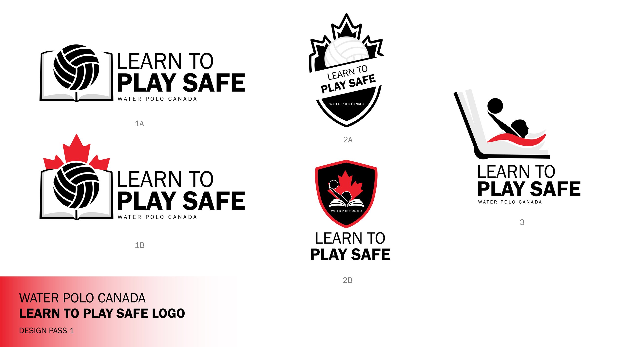
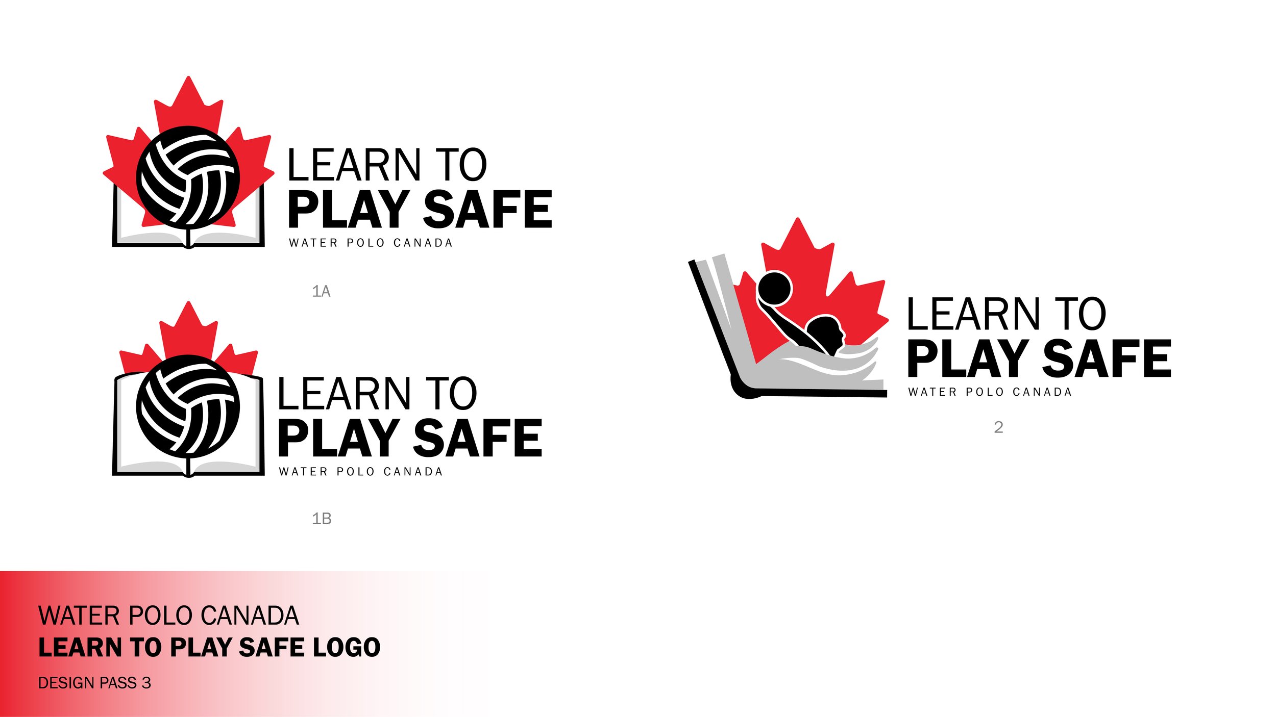
I was honoured to be hired to design two logos for Water Polo Canada, each representing significant initiatives within the organization. The first logo is dedicated to the new Learn to Play Safe program, aimed at consolidating essential safe sport information for members and registrants. The second logo celebrates the Canadian Water Polo Hall of Fame, which recognizes the remarkable achievements and contributions of Canadians to the sport of water polo.
My logo designs focus on integrating the existing elements of the original logo, featuring the Canadian maple leaf and a person, into two distinct concepts tailored for different purposes.
For the "Learn to Play Safe" logo, I introduced a book element to emphasize the importance of knowledge, opting for a combination mark that maintains a modern and fresh aesthetic while preserving the essence of the original design.
In contrast, the "Hall of Fame" logo was crafted to resemble a medal adorned with laurel imagery. The challenge was to incorporate the two long names into the design while achieving a balanced and harmonious visual composition. Both designs successfully honour the traditional elements while catering to their specific goals.
Top Two Designs Before Final
Hall of Fame Design Process


Learn to Play Safe Design Process
